Cheryl is a visual designer specializes in creating compelling visual solutions that drive brand awareness and engagement.
Header.png

UX/UI Case Study // Brooklinen


UX/UI Case Study: Brooklinen

Venturing into product design, I decided to take on the challenge of a case study. The prompt was to choose a retail mobile website experience (section, screen, flow) that I liked the idea of for a customer but for which the design could be improved. I decided on Brooklinen’s “Best Seller’s” page.


Current flow

I love Brooklinen’s brand and its visual design language. Still, I noticed its “Best Sellers” page was difficult to navigate.

The site structure is currently
Homepage > Best Sellers > Product Page > Cart
The “Best Sellers” page aims to put the most popular items in front of the user for a quick and easy turnaround to order.


The problem

The mobile site for the “Best Sellers” page features a product carousel that shows 1.5 products at a time. According to one Nielsen Norman Group study, most people stop after viewing items in a carousel after seeing 3–4 different items. Brooklinen’s carousel contains as many as 14 items. According to this group study, my hypothesis is that there is low to zero engagement after the 3rd item. Carousels are meant to condense information while not occupying too much vertical space. Since Brooklinen is dedicating an entire page to their best sellers, we should utilize every bit of this page.


my process

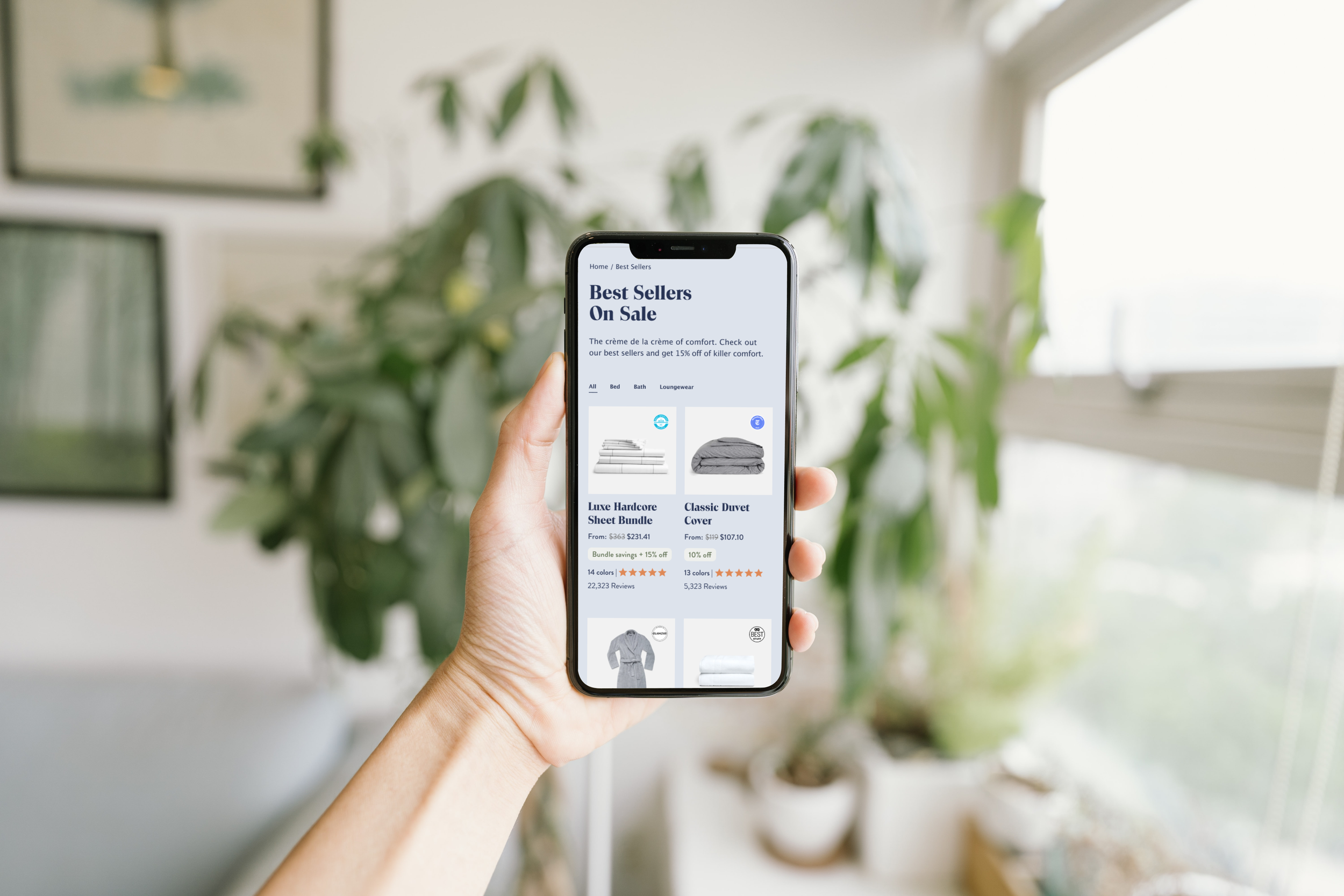
Since a “Best Sellers” page aims to simplify the user’s ability to filter through products and highlight the company’s most popular items, I decided to maintain consistency with the website’s current UI patterns by utilizing a two-column product grid. This common layout makes it easy for users to scan multiple products while highlighting important information. Using other, higher-end retail stores, I took inspiration from their websites to see how they highlighted their products and Brooklinen’s design system to make the page fit in seamlessly with the site. The other solution I created was the use of horizontal filters. This will help the users quickly filter out their desired products without having to do much work. And finally, I removed the product description to elevate the design and to create less for the user to sort through the options quickly.


Final Product

After a few versions, I designed these two versions of the “Best Sellers” page below. This product grid will allow users to easily scan multiple products within a single view, allowing for higher engagements for products below the fold. In addition, it will create a seamless and enjoyable experience for the user.

I went through many different mockups and ultimately I added an additional option for a version with a header to make the page feel more editorial and elevated. However, since the page's purpose is to view to the products quickly, I chose the version without the header as my final product.